- HyperForce #1
- Created & Written by Adam Matthew Smith
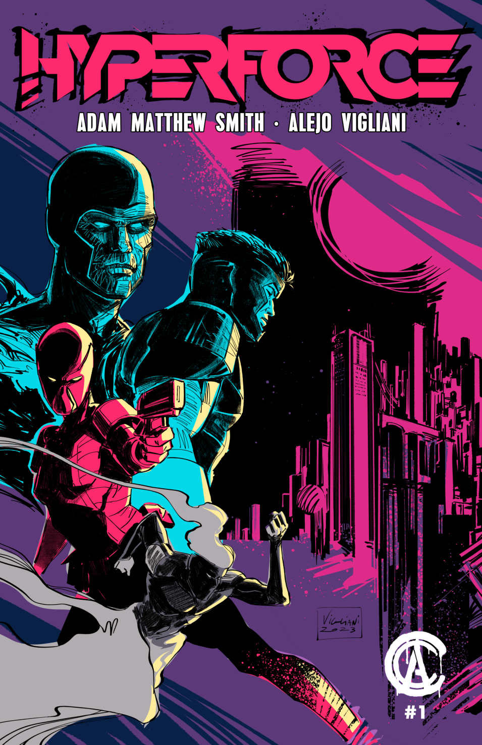
- Illustrated by Alejo Vigliani
- Letters by Max Flowers
Step into a neon-lit future where humanity’s last hope lies with the hypersapien antiheroes of HyperForce. As they combat the malevolent Dr. Ion and his monstrous creations, these unlikely heroes grapple with their own powers and demons. HyperForce embarks on a pulse-pounding cyberpunk odyssey, crafting a thrilling saga of identity, ambition, and redemption.
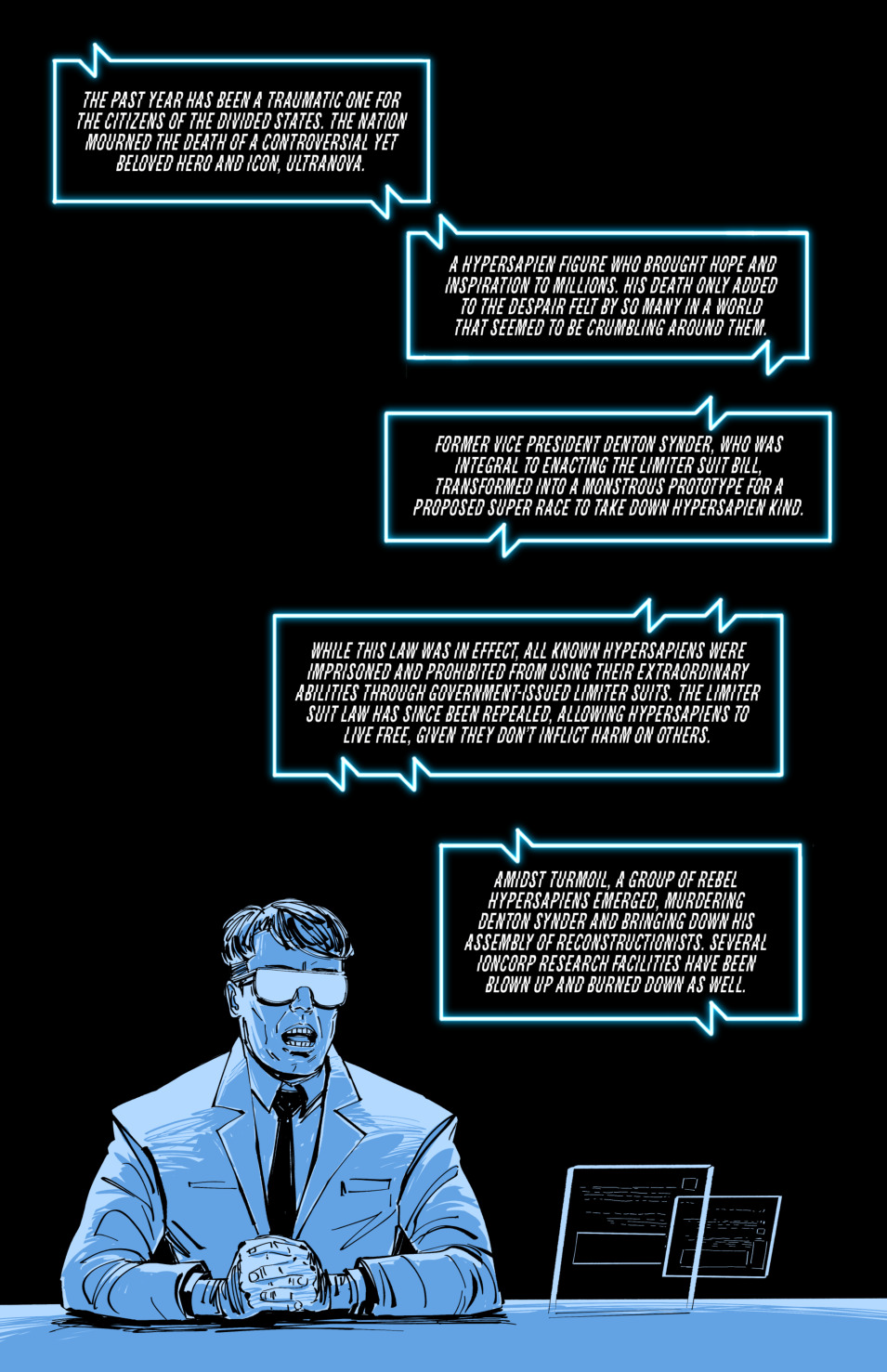
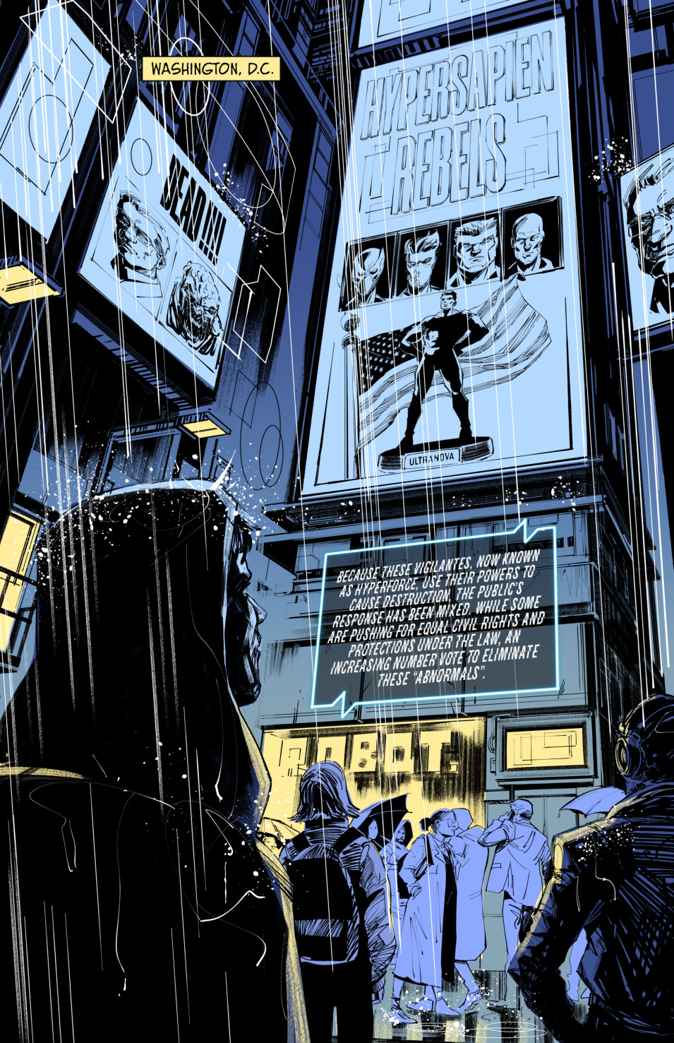
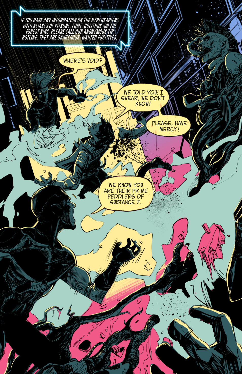
Billed as a “post-superhero” cyberpunk series, HyperForce introduces itself as a story full of gray areas, figuratively and literally. On the more ambiguous side, there don’t seem to be many “good guys” in its pages. There’s one truly heroic character mentioned, Ultranova, recently deceased and no longer standing as the ideal among hypersapiens (ie: HyperForce’s non-litigious stand in for “mutants”). In his place, the Fatal Fouresome (not their official team name) of Kitsune, Golithos, Fume, & the Forest King prowl among a populace that hates and fears them.
Gotta say, going by issue #1, some of that hate and fear seems kinda fair.
Writer Adam Matthew Smith is following in the footsteps of the ‘90s brand of comics pioneered by the likes of Wetworks, Cyberforce, & WildCATS. This cyberpunk world he’s created (starting with a successful 2022 Kickstarter for his graphic novel Shadows) hovers on the dystopian edge, with anti-hypersapien hysteria at its core. As an homage to those ‘90s comics, Smith’s story works as a throwback to simpler times. One thing that stood out to me, before I read Smith’s bio and learned of his background as a songwriter, was the lyrical quality used to tell parts of the story. HyperForce may not be breaking new ground but as the story develops, he has left himself room to grow.
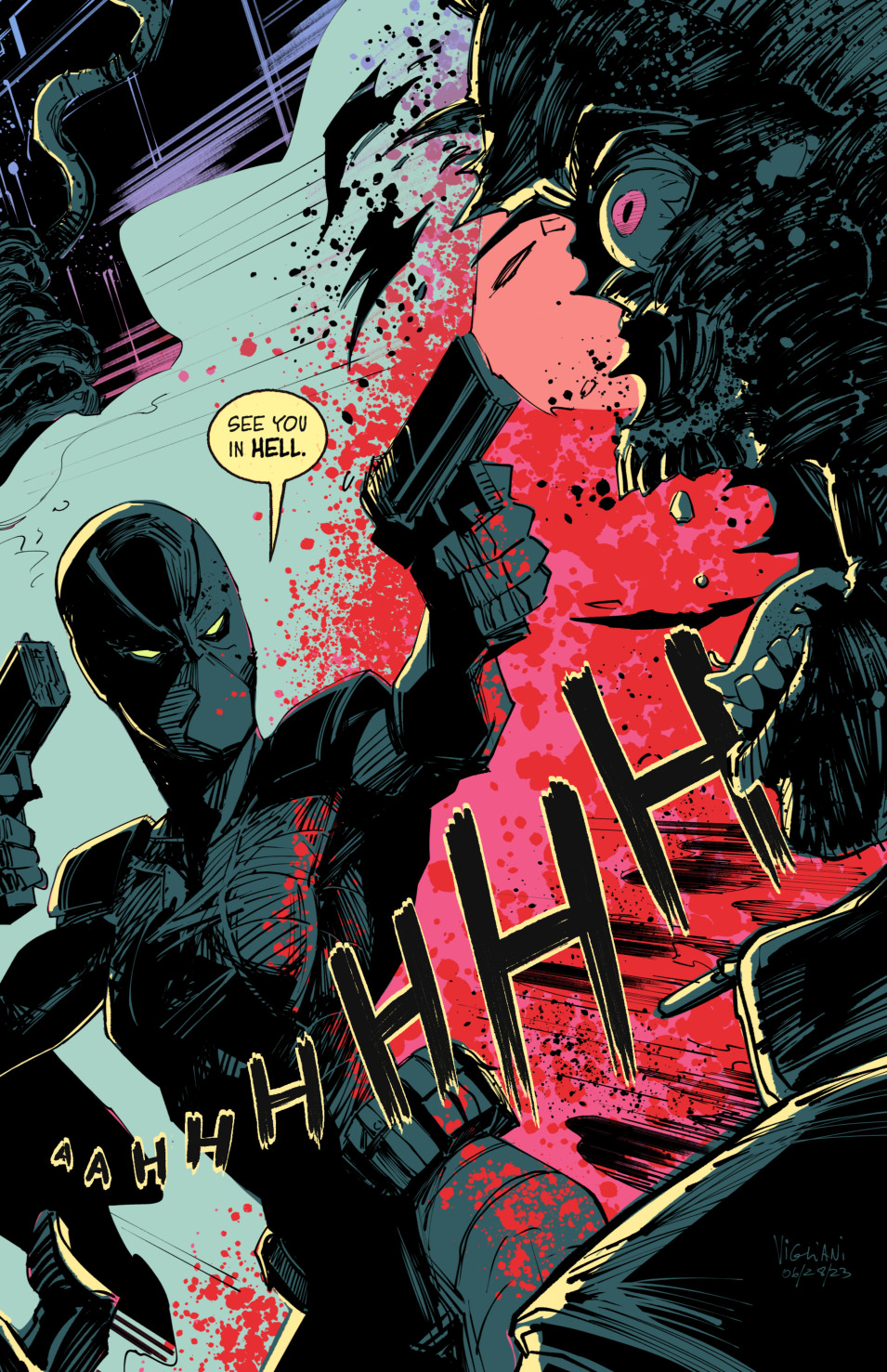
Visually, there are gaps. Alejo Vigliani’s style is nothing if not kinetic, displaying the action on the page in a way I can only think of describing as edgy. Lines are left rough, full of scratches and splatter effects that reflect the frenzied cyberpunk setting. There are pages where more color could have enhanced the storytelling, or at least made some of the characters easier to make out. I got the impression that Vigliani was going for a florescent neon look, but for my taste it turned out to be a little too much. The action scenes, however, are where Vigliani’s work shines. His layouts leaned into a cinematic Shaky Cam style that gave the pages a dynamic sense of movement.
Here’s where I lose some good will, and Max Flowers… if you’re listening, take my critique in the spirit with which it’s offered.
The opening of HyperForce uses a digital newscast to handle some backstory. It’s a solid ploy, tricking the reader into sitting through exposition to catch them up. But I didn’t read any of it. The lettering, stylized and laid out in white on a black background to give the impression of a digital transmission, was tough to read and annoyed me. That style of lettering was used periodically throughout the book, and I passed right over it every time. Comic book lettering isn’t the same as graphic design. Going out of your way to make the lettering artwork, trying to make it stand out, takes away from the story. In my reading, the very best comic lettering almost fades into the background. That’s not always an easy thing for an artist to willingly do, but fonts need to be easy to read, or you’re going to lose readers.
HyperForce has something to say and deserves to find a wider audience to hear it. Adam Matthew Smith is pulling from several points of reference, not the least of which is his own personal need to express. Likewise with the rest of the creative team. Any criticism I offer is just one opinion and should be seen as a chance to expand the appeal for a broader range of readers.
Final Score: 9/13