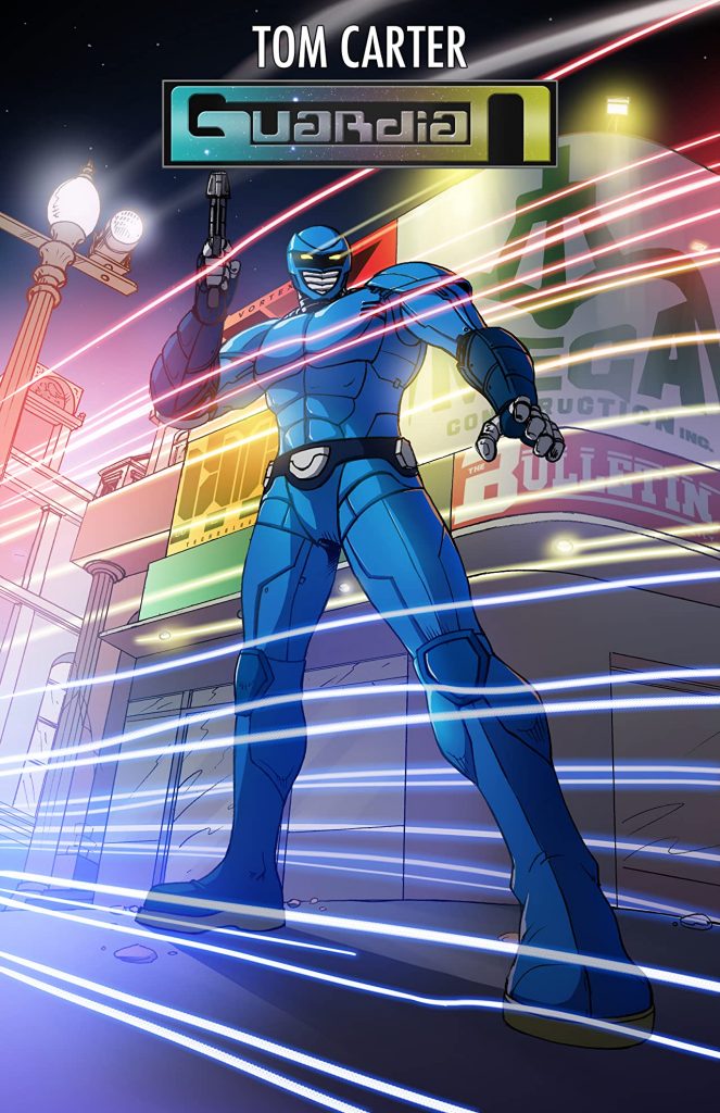
- Guardian #1
- Created & Written by Tom Carter
- Illustrated & Lettered by Haryadi Jang
- Colors by Papillon Studio
- Variant Covers by
- Mitch Gosling
- Tom Gallagher
- Edited by Nick Revels
Zack finds himself attached to an alien life form. Gaining his super powers, they become a new superhero fighting against their arch-nemesis, Mars the Destroyer and the biggest crime boss known as Maverick.
I’m going to start this article off in reverse, summing up my thoughts & opinions ahead of time because in this case I think the bottom line is more important than the specific breakdown of the review. Guardian is that most precious of things, an independent comic created by people who love comics. This is why thePullbox exists, in the hopes that our tens of readers will take a moment to check out a small title, appreciating it for its potential and not just being hung up on a lack of polish. Fans of old school superhero comics who might be interested in getting in on the ground floor of a brand new story- and God willing, a series that branches out into a new superhero universe- should take a minute to at least take a look at this one.
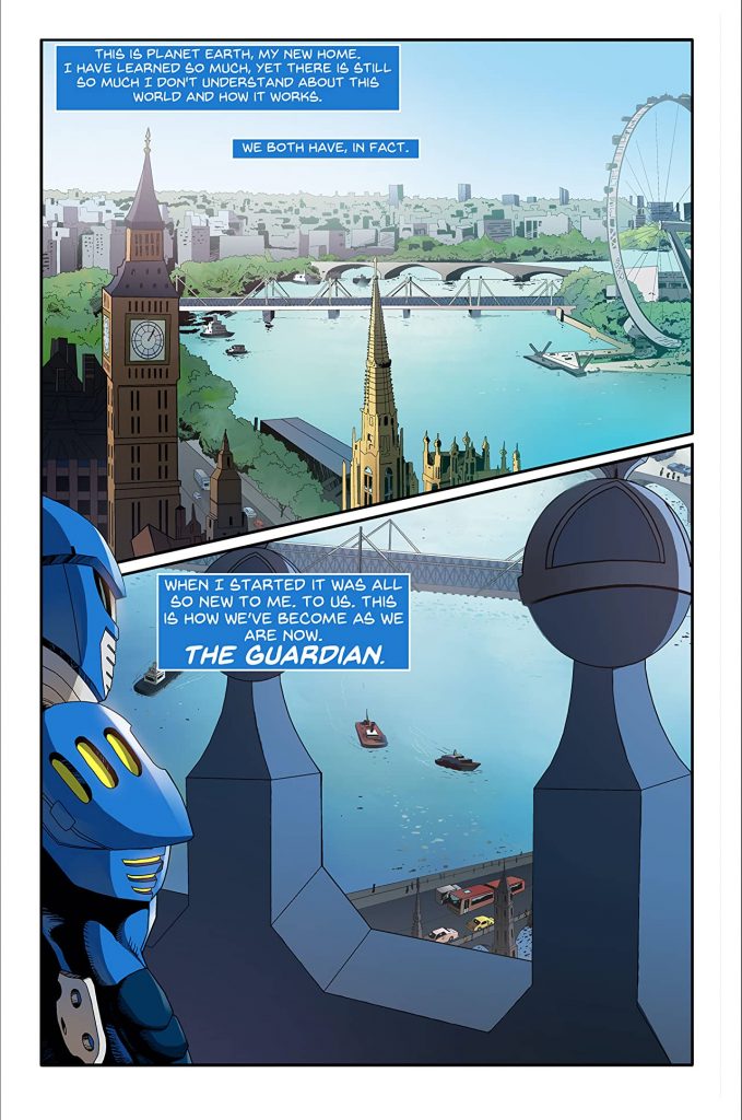
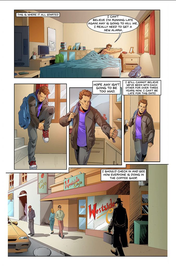
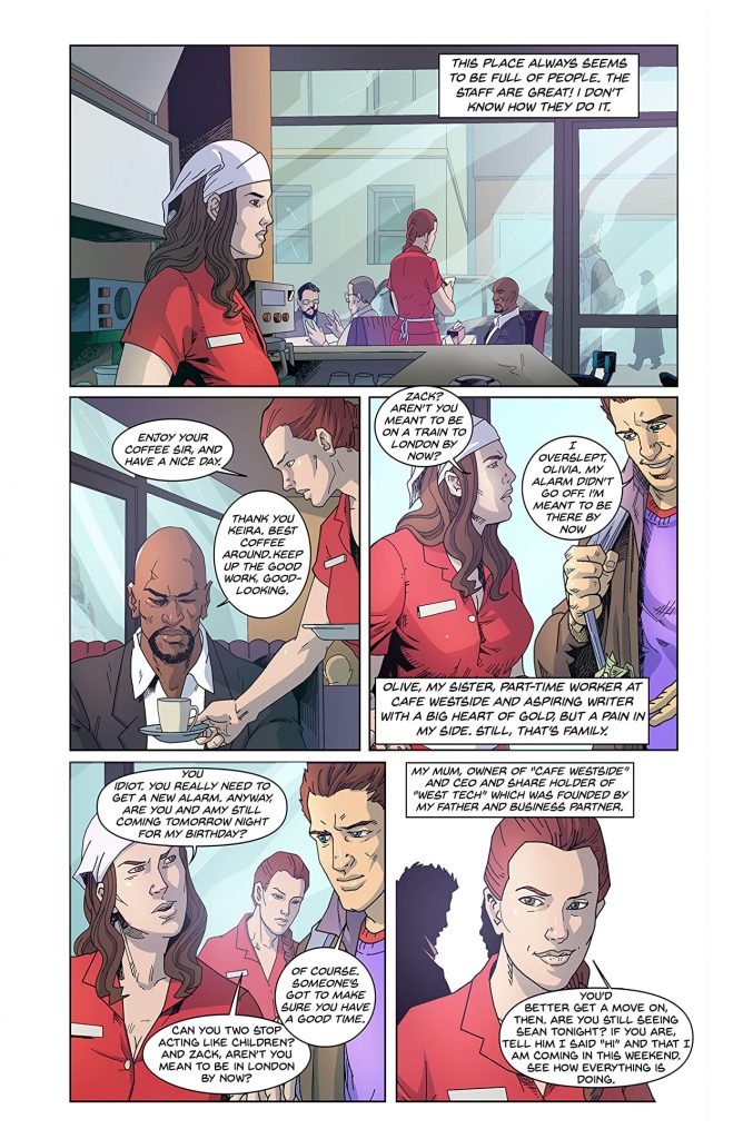
Tom Carter is my friggin hero. Here’s a guy who grew up reading comics, starting out with (according to his afterward…) the staples of Spider-Man & Batman before diving headlong into UK titles like The Beano and 2000A.D. His story starts out with a “day in the life” of his main character, or at least one of them, Zack. He’s an ordinary dude, doing his level best to live up to the ordinary expectations of friends and family. The first twelve or so pages (do you count covers or credit pages?) are spent following him around London as he tries to make it to a date and check in with some friends, in the end winding up somewhere he probably shouldn’t have been. Basically it’s the classic superhero origin. It might take a while to get us there, but the payoff is kinda worth it as the Guardian is a nice blend of traditional and non. It takes elements of heroes from manga & anime like the Guyver and Kamen Rider, with a touch of the classic knight in shining armor to cement his status as a champion for the UK.
Carter sets up the rules pretty quickly once Zack and Guardian are joined, establishing that the new hero’s power levels are closely tied in to his state of mind. That’s a slick ploy, showing that the character is someone with room to grow and evolve rather than sticking readers with a static protagonist who’s already operating at peak. Likewise, readers get to see that, like many new writers, Carter is feeling his way along. He spends a lot of time setting up his characters and their world through dialogue and narrative boxes. It does get a little repetitive and occasionally, in my opinion, heavy-handed. That isn’t a total dig on Carter’s work. Good dialogue is one of the hardest aspects of writing to master, one that some who’ve been around for decades will tell you they’re still working on. Getting dialogue down to where it flows naturally is a trick that takes more effort than some might think. I’d like to see Carter dip a bit into a “less is more” philosophy of writing, allowing his story to be told in part by the artwork, the action on the page, and elements of the background… sharing the storytelling with the artist in a more collaborative effort. That kind of “let it go” attitude is difficult to find, but I have no doubt that given time, he can find a balance.
Haryadi Jang presents a look and feel in his illustrations that highlights the throwback nature of Guardian. The character designs keep the cast distinct, and everyone has a thing to set them apart from everyone else (Zack’s seems to be the backpack he keeps lugging around, even when he’s putting on shoes and out on a date). Jang puts just enough detail into his backgrounds to remind us that there is in fact a world out there, but keeps the focus on the action when it kicks into gear. One thing that might really make the fight panels pop would be some sound or action effects… during the climactic battle of the issue, it was a little difficult to tell what punches were landing and which were whiffing because there were no effects indicating a hit. It’d be nice to see Jang play around with a few things like dissolves and blurs, just to get more creative with his work as he moves forward.
The same can be said in the coloring department. Papillon Studio handles the job ably in a pretty straightforward style that works well with Jang’s drawings. Where it would be great to see some growth would be in a use of blur effects, something more eye catching than simple lines penned in to show movement. There are many books out there where the colorist really knocks an action scene out of the park with a more inventive use of the palette.
Okay, I lied a little… I said I was starting with the closing, but apparently I’m not done talking yet. Guardian is an opportunity to witness growth, both from the characters and their creators. Instead of passing it up for a larger title with more polish, readers get to see the polish happen in story as skills are refined and developed. That by itself should be worth the price of admission for many.
Final Score: 8.5 (the decimal point tacked on for the potential & room to grow)