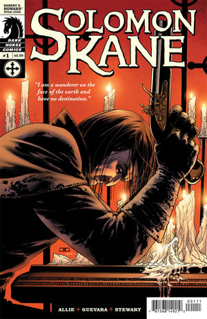
 Solomon Kane #1 (Dark Horse – Allie / Guevara)
Robert E. Howard’s vengeance-obsessed puritan begins his supernatural adventures in the haunted Black Forest of Germany in this five-issue adaptation of Howard’s “The Castle of the Devil.”
When Solomon Kane stumbles upon the body of a boy hanged from a rickety gallows, he goes after the man responsible–a baron feared by the peasants from miles around. Something far worse than the devilish baron or the terrible, intelligent wolf that prowls the woods lies hidden in the ruined monastery beneath the baron’s castle, where a devil-worshipping priest died in chains centuries ago.
Dark Horse’s original Conan editor, Scott Allie, writes the series, with art by Mario Guevara and Dave Stewart, who reinvents his revolutionary color technique from Conan.
The problem with reviving Solomon Kane, Kull and even Conan (for the most part), is that none of them are an improvement over the earlier versions that came before them. Of course, there is nothing that will probably ever surpass the Buscema Conans, but still.
In addition, this version doesn’t do justice to the tone of the source material. And you don’t start a Solomon Kane story with some lame action scene, that’s not what make the character and original stories good. There’s something about the art also that makes your mind disconnect. I’m able to distinguish main characters, usually, but there’s nothing distinct in their rendering that draws me to them or makes me identify with them. They are indistinct and blurry. The sequential story telling is weak also, the panels conveying at most some random action, usually unrelated to the dialog, just needed some pictures to go with the words. I’m not saying Mario Guevara isn’t a damn good artist, he is, his style is nice, his figures competent, but the sequential art is weak, and distracts from the story, which already a bit weak. In this book John Silent is just a guy, not a guy who won’t shut up. He’s barely the comic relief he should be. The story lacks any sense of timing that would convey these personality traits which is what should drive the story.
And @#$%^&*! The art ISN’T INKED, which is my all time best and favorite pet peeve.
This may be a young artist unable to get it all done by deadline, but if it was an artistic choice, as with Conan, it is a bad one! Some noble octopus gave his life for a bottle of Speedball Super Black, the least comic artists can do is use it! In addition to no ink thing, they did the color over the lines thing (used extensively over Dedoto in Thunderbolts) which I can’t stand. It makes already, blurry distant art more distant. Dark lines go on top of color, especially if they are ink lines. It’s the rule. Laziness and technology shouldn’t change the rules. . Sometimes dark lines can be replaced by color (think Giffen’s early Legion stuff), but under no circumstances should color ever get washed over a line in a comic book. Shame. Overall a C- for turning up their noses at the laws set down by the comic book gods. If they get some ink in there and better pacing it could be a decent book, but I’m not holding my breath.