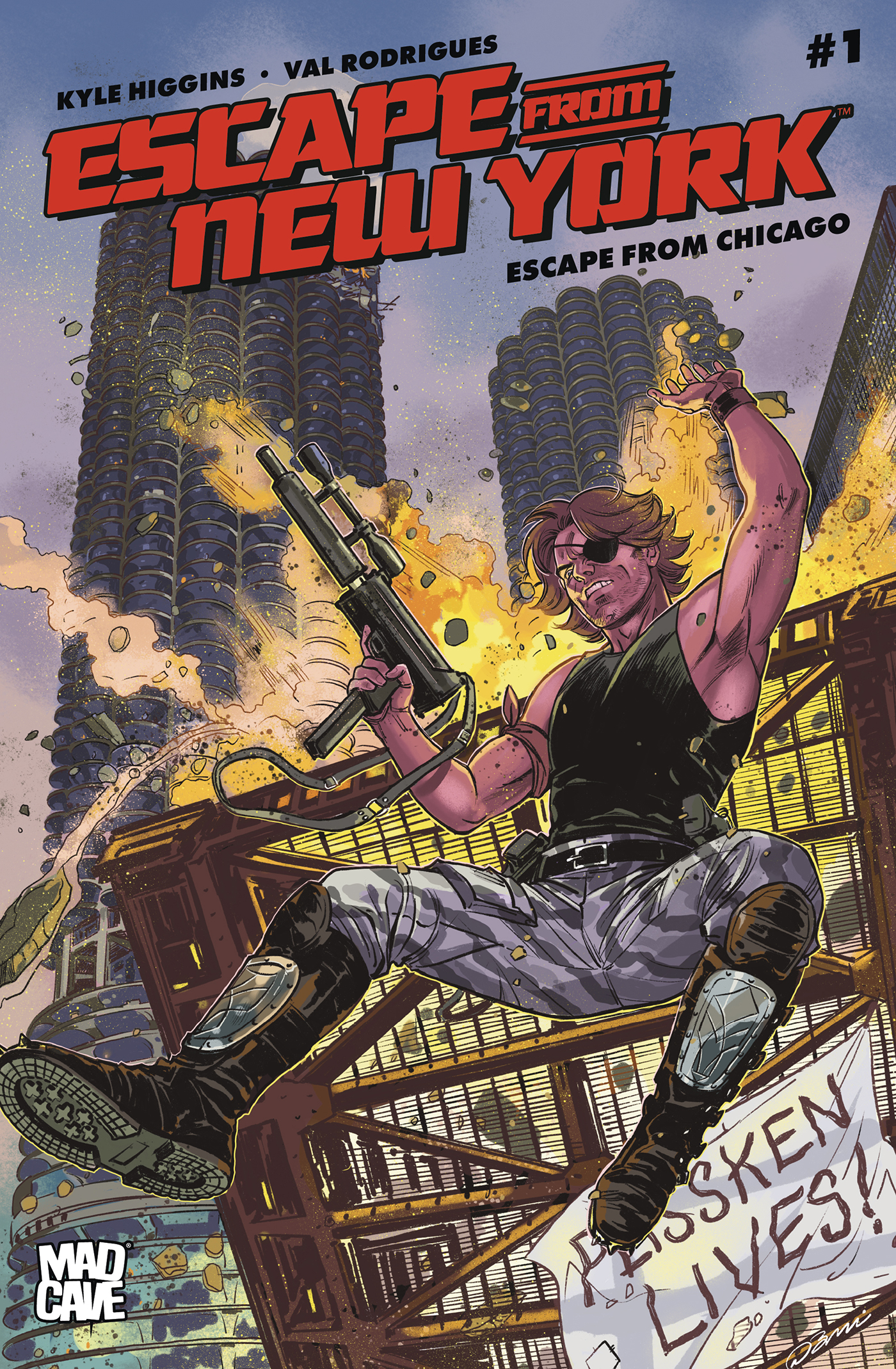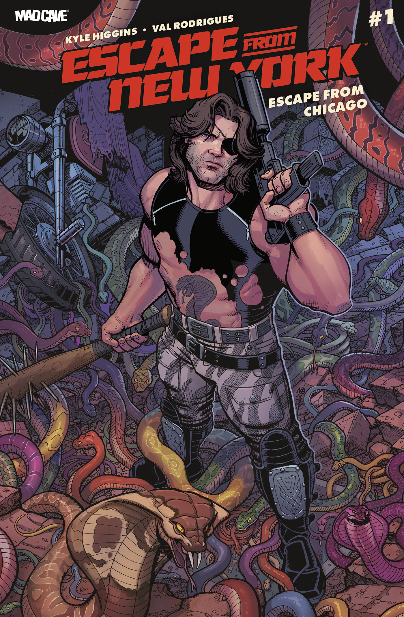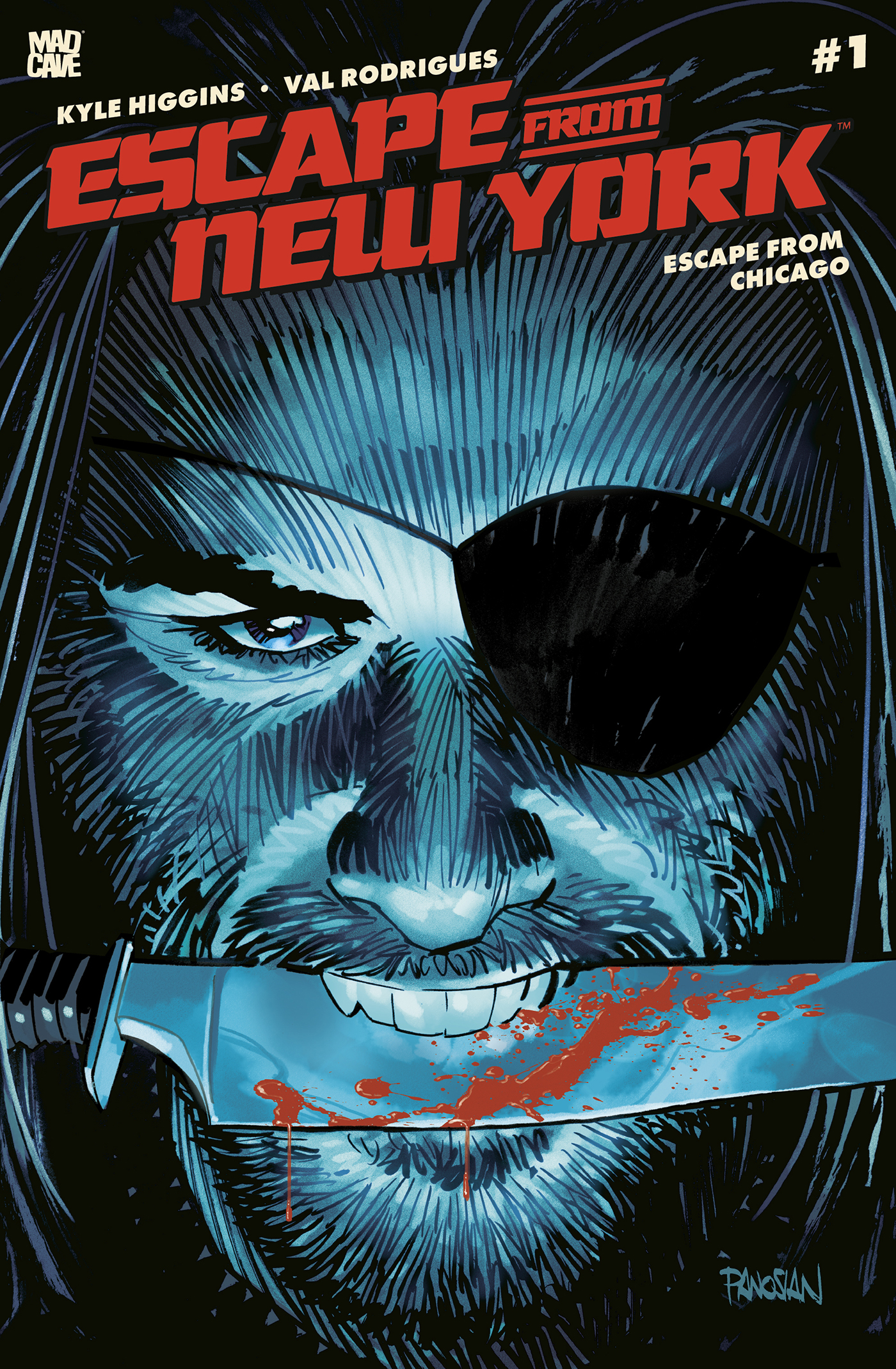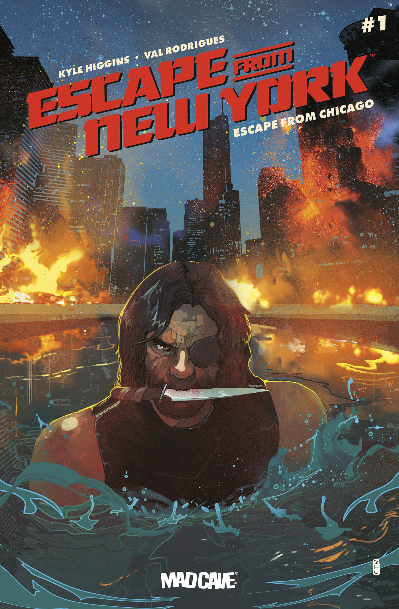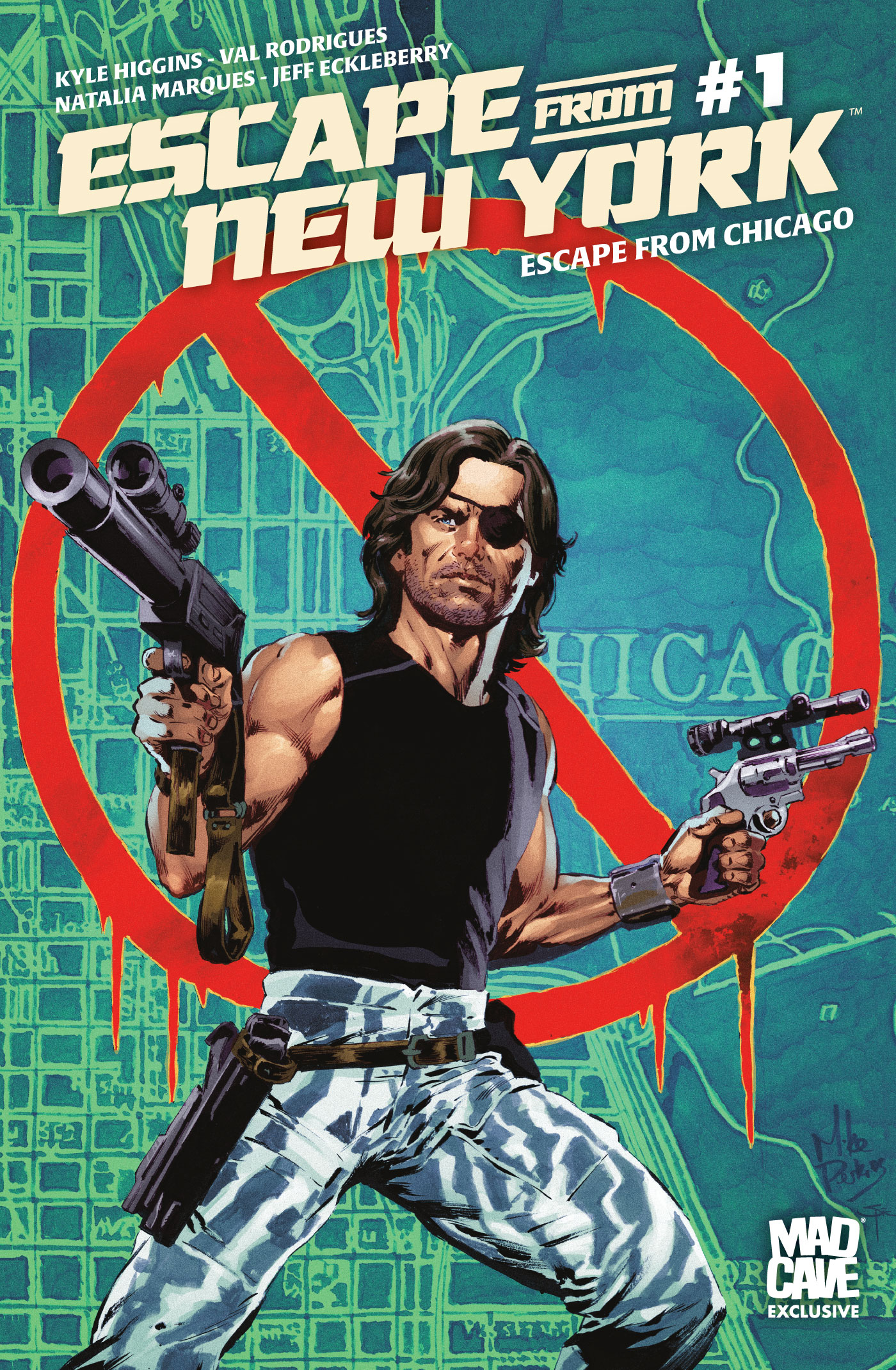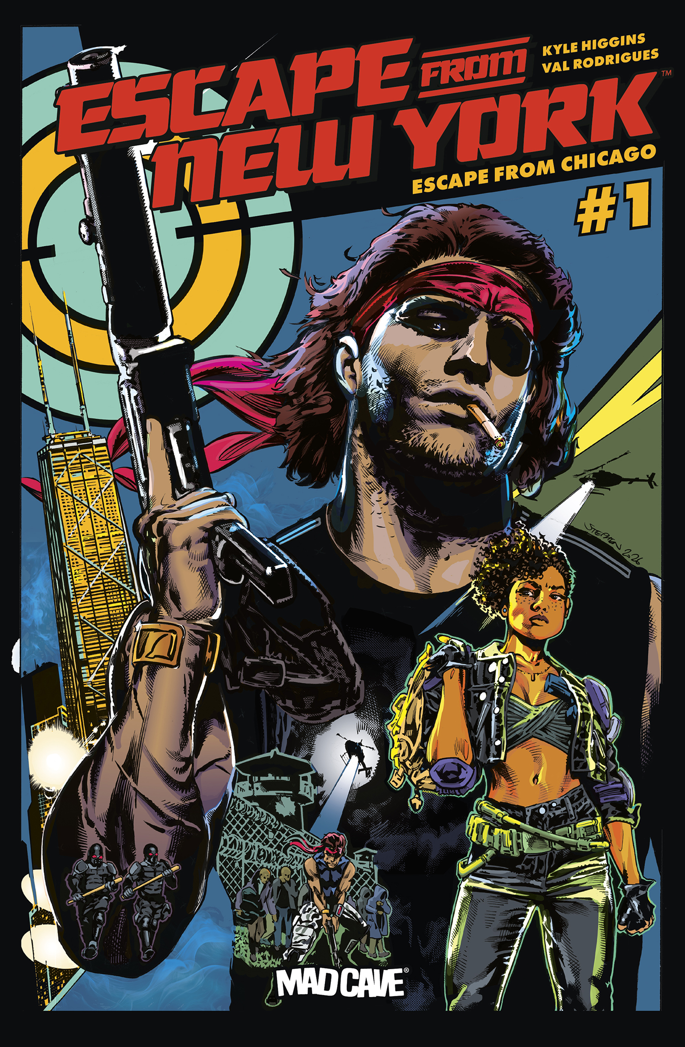
- Escape From Chicago #1
- Mad Cave Studios
- Written by Kyle Higgins
- Illustrated by Val Rodrigues
- Colors by Natalia Marques
- Letters by Jeff Eckleberry
- Covers by
- Stephen Mooney (A)
- Danica Bradshaw (B)
- Dan Panosian (C)
- Christian Ward (D)
- Nick Bradshaw & Jimmy Charalampidis (E)
- Mike Perkins & Mike Spicer (MCS Exclusive)
- Marco Santucci (Con Exclusive)
Once you go in, you don’t come out—
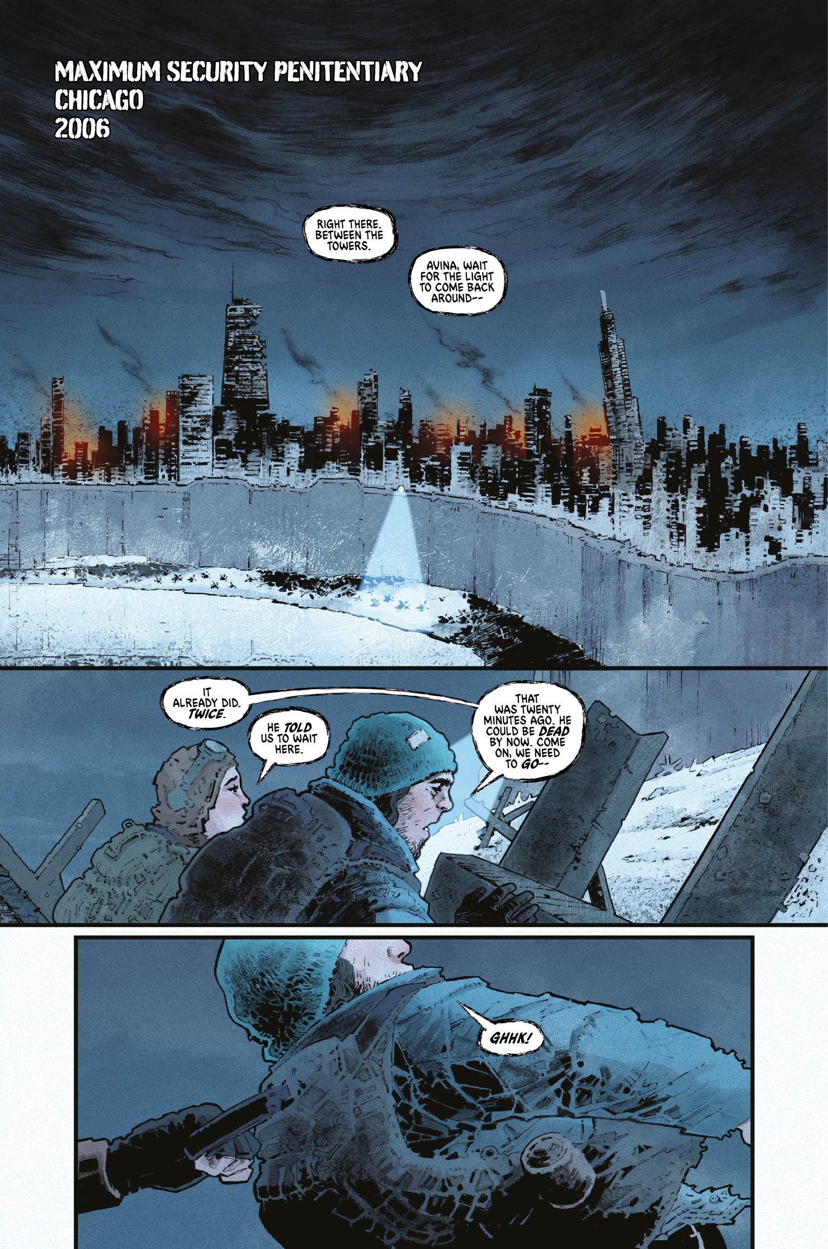
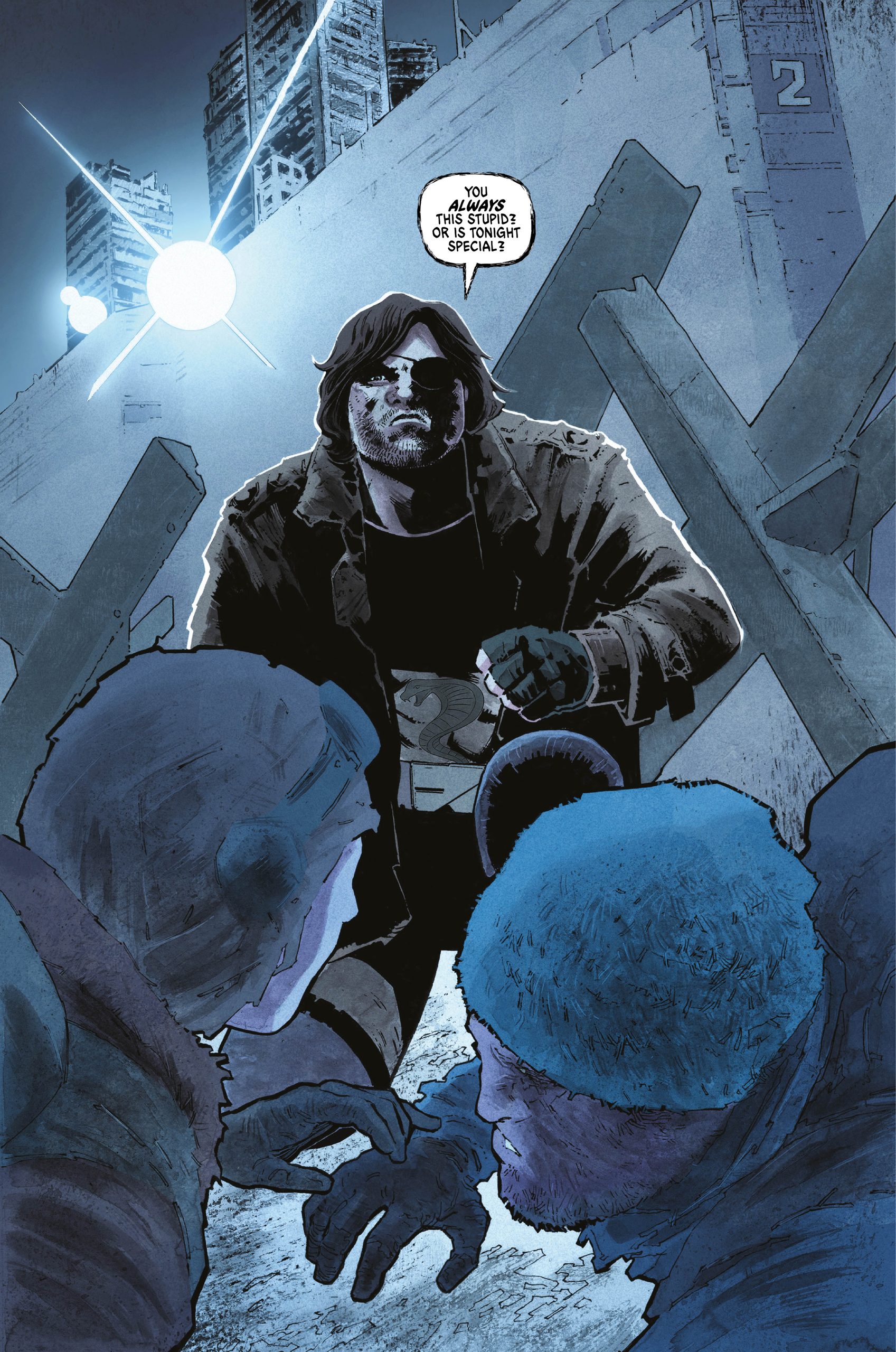
—unless your name is Snake Plissken! Plissken now survives as a coyote, smuggling people and contraband across the dangerous dead zones between prison territories like Chicago. It’s a hard and bitter job. But when he’s hired to extract a woman wanted by the city’s warlord, Snake sees one more chance at redemption—or one more chance for the universe to kick his ass. Introducing new settings and characters with all the dystopian insanity you know and love, superstar writer & film director Kyle Higgins teams with artist Val Rodrigues for an explosive new series revamping the beloved film franchise!
There have been a few swings at this particular corner of the Carpenterverse. There was even a crossover miniseries where notorious Snake Plisskin teamed up with eternally out of his league Jack Burton, mined for repeated laughs & much mayhem by Boom! Studios & with the blessing of John Carpenter. Next in line to take a bold new bite out of the Big Inescapable Apple is Mad Cave Studios, with writer Kyle Higgins & artist Val Rodriguez taking the wheel.
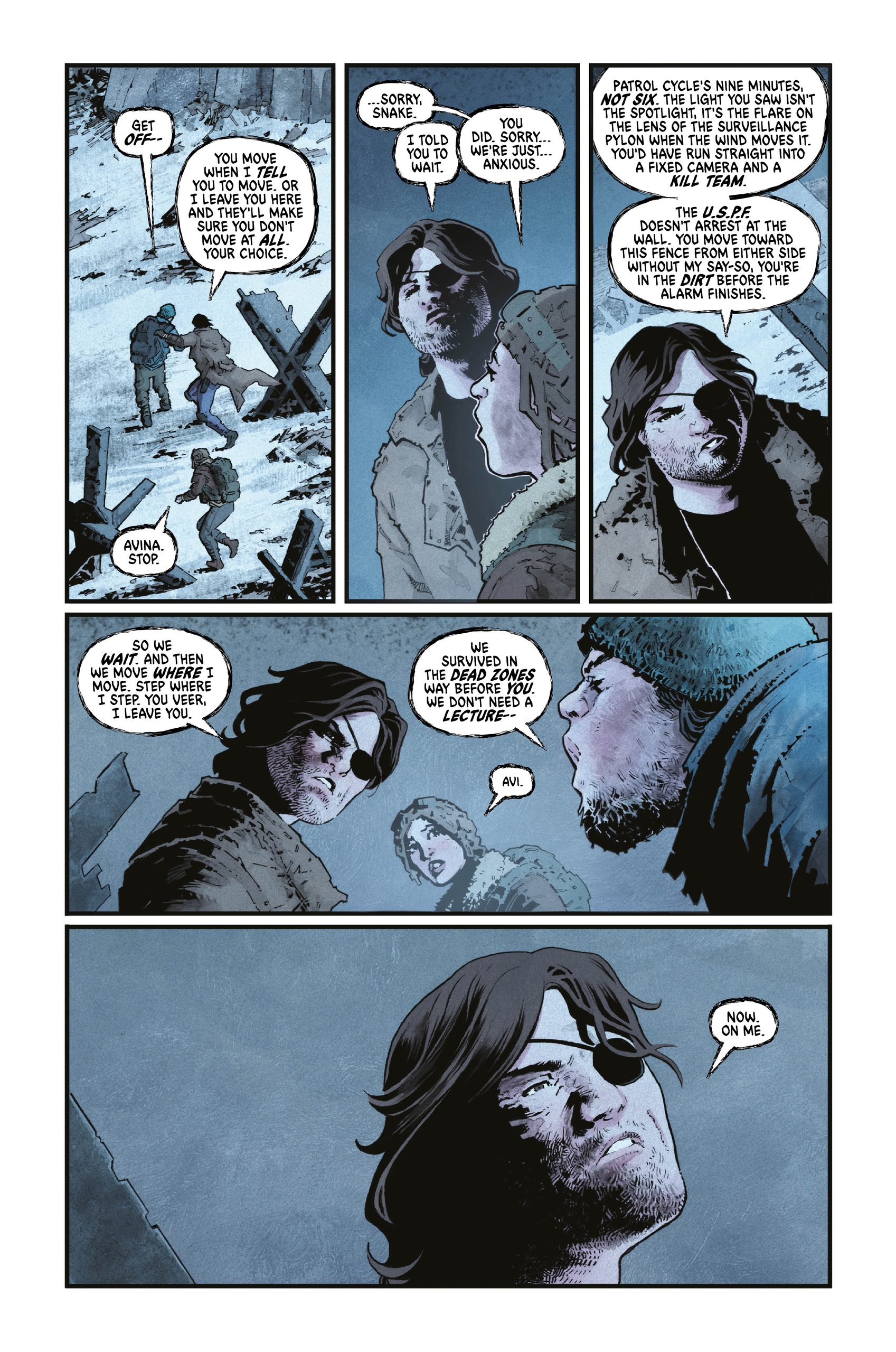
Kyle Higgins is doing a thing that not many have had the stones to do since he escaped from New York… He’s writing Snake as complete and total bastard. This is no anti-hero, rough around the edges with a heart of only slightly tarnished gold. Plissken is a survivor, plain & simple, living on the fringes of a world that snorts disdainfully at what you think you know as dystopian, and he certainly isn’t interested in redemption. From what I’ve seen so far, and read about what’s to come, Kyle Higgins is looking to grab Snake by the scruff of the neck and rub his nose is the consequences of some of his less than cool acts.
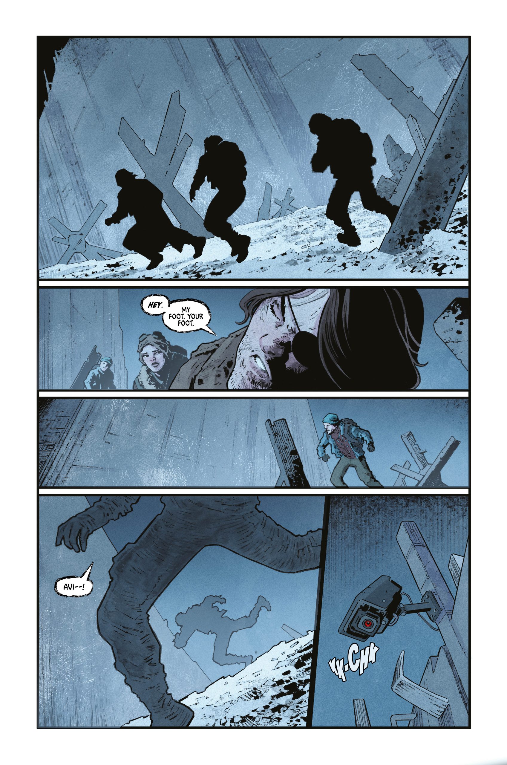
Artist Val Rodrigues is tasked with adapting the visual bones on which the world of John Carpenter is built. Rodrigues’s style is all grit and jagged edges, with barely a smooth line to be seen. Where his approach is especially effective is in the close-up panels. Those tight, cinematic perspectives bring a lot of character detail and reaction shots to the forefront as things continue to happen “off screen”. Bringing meat and gristle to the artistic bones, colorist Natalia Marques contributes to the aforementioned grit of the book’s look. Her color palette creates a drab, sunless place inhabited by desparation and shadows. In the few brightly lit scenes, details revealed in the backgrouns do nothing to uplift the mood.
I don’t know… it kinda looks like everyone did their homework on this one.
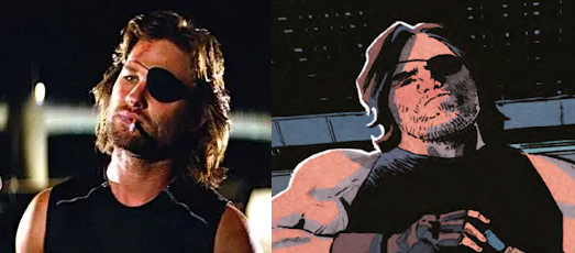
I can’t walk away from this one without giving a much-deserved nod to the work of letterer Jeff Eckleberry. He keeps the panels clean, never interrupts a shot, and uses subtle effects to enhance the tone of the story without going overboard. If you’re not sure what I’m talking about, there’s a good chance you have never come across an example of bad lettering.
I’m a huge fan of John Carpenter’s classic movie (less so the L.A. based follow-up), and often find myself protective of the flicks I’ve loved since I was too young to legitimately watch them. I’ve got no compunctions in recommending this one, kids. If you heard Snake was dead, you heard wrong…
Final Score: 12/13