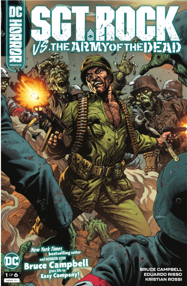
- Sgt Rock vs The Army of the Dead #1
- DC Comics
- Written by Bruce Campbell
- Illustrated by Eduardo Risso
- Colors by Kristran Rossi
- Letters by Rob Leigh
- Cover art by Gary Frank & Brad Anderson
- More variant covers than you can shake a stick at
- Francesco Francavilla
- Charlie Adlard
- Chris Mooneyham
- Pia Guerra
- Frank Quitely
I know what you’re thinking. Paul… ThePullbox reviews indie comics. This is DC! It’s like the world is upside down and we’re teetering on the edge of the Abyss! Relax. This is just a tiny little detour because I read a comic that I’ve been craving for years and wanted to talk about it because it’s just that cool.
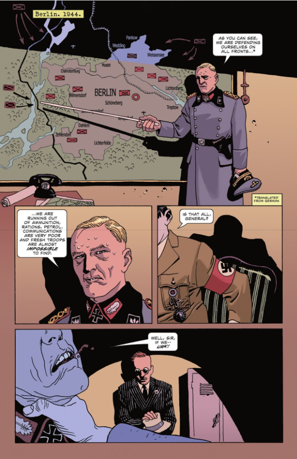
In all honesty, we love the Golden & Silver Ages of comics because of what they brought us. But have you tried reading some of those old stories? Some of the writing back in the good ol’ days can be a little rough, and I’m always on the lookout for new takes on the old classics. Not a “re-imagining”, or modern version, but a serious trip back in time that isn’t bogged down in dated writing. And along comes Sgt Rock, the cigar-chomping, hard-fighting, nazi smashing Staff NCO in charge of Easy Company, originally created by Robert Kanigher (writer) and Joe Kubert (artist) in 1959.
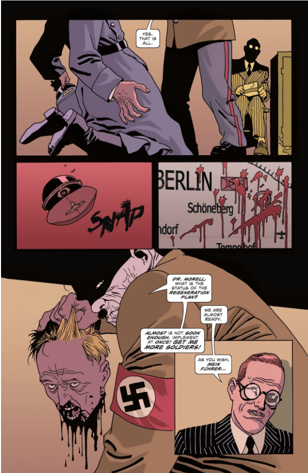
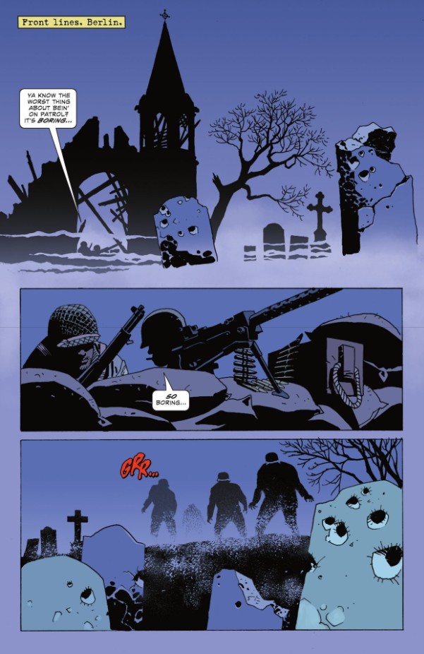
While the men of Easy are still ready to take on the enemy, anytime and anywhere, the Third Reich has thrown a twist into their march against the Allies. Through chemical and technological experimentation, Hitler’s forces are getting ready to add the walking dead to their ranks. And if we know one thing, it’s that finding dead bodies for use in these trying times won’t be a problem. All that is left to figure out is who might have the creative expertise to write a convincing story about battling the undead.
Bruce “The Chin” Campbell, that’s who!
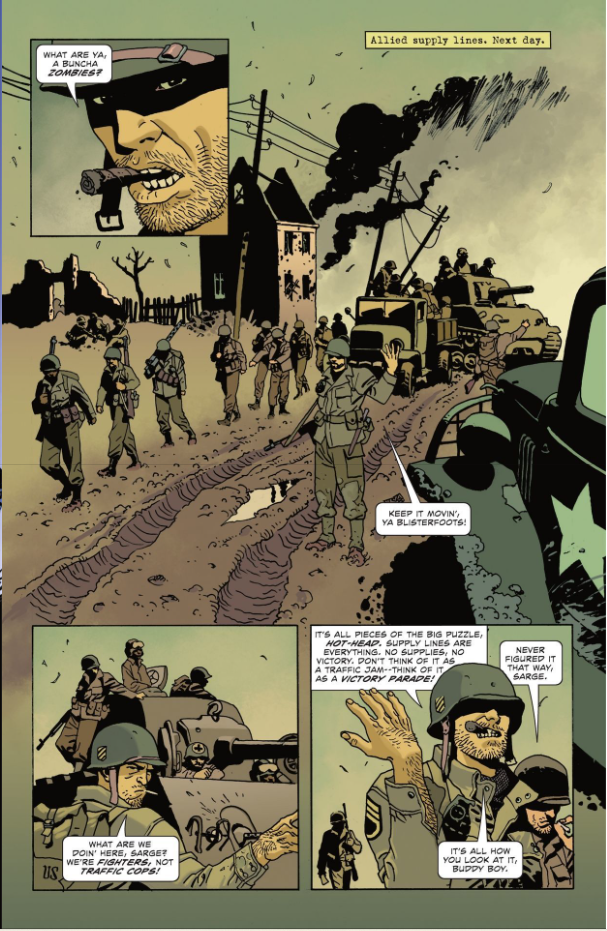
In a brilliant example of “well, of course, who else?” we have Bruce Campbell diving into the perfect comic book arena. While this isn’t Campbell’s first writing credit, I believe this is his first full comic series where he’s alone at the helm. I couldn’t be happier with the result. Sgt Rock vs the Army of the Dead has a near-perfect blend of writing with a modern sensibility while allowing the time period to shine through. What I think is even better is that Rock and the men of Easy Company show the sense of Brotherhood that’s built on having crawled through the same mud & shed the same blood. As for the story itself, I like the pacing. There’s that first reveal in the opening pages, and then Campbell slows things down to introduce the major players. It may be a break from the normal story outline, but it sets the stage beautifully. We’ve seen the zombies and the problems they’re going to present for soldiers trained to aim for “center mass”, and then we’re brought into the lives of the soldiers who are going to be tasked with defeating the undead horde.
The artistic team of Eduardo Risso (illustrator) & Kristran Rossi (colors) have the task of creating the atmosphere of Campbell’s story, from the mist-shrouded battlefield to mud-caked supply lines, and finally into the starkly lit war rooms where plans are laid. Risso’s layouts break out of the traditional grid, opening the page up and letting readers take in the scene in a full-page spread, with panels laid out to zoom in on the details. Also, Risso’s character designs are fantastic, paying attention to detail and reflecting the times in both uniform styles and (maybe regulation) haircuts. Rossi’s colors fill in the gaps, bringing the grit of the field and the cold sterility of the lab to the pages. Between the two of them, their work is like a pair of Shaolin masters bringing their kung fu styles together to form a super Mecha-Battlebot!
I might’ve mixed up my metaphors there, but I’ll stick to what I said.
The last piece of the puzzle I want to talk about is the lettering by Rob Leigh. There’s a lot to take in, for the reader with the patience to do more than scan over the page to get to the next bit of action. Leigh’s text boxes are styled to look like the captions were banged out on a manilla file folder with an old manual typewriter (kids, ask your parents). His dialogue skips around, from the plain ol’ conversational fonts we know and love, to a more jagged-looking set when things start getting… zombified. And with all that stylization, Leigh walks the fine line between flashy technique and unreadable drek. If you’re not sure what I’m talking about, there’s a chance you have yet to run across a really bad job of comic lettering.
That I was going to pick up the first issue was a foregone conclusion, based on the novelty of it alone. Like I said, I’m constantly on the lookout for this kind of dip back into the classics. That I’m going to be picking up the entire series and looking forward to each issue is because, as a writer, Bruce Campbell gets me. There’s the characterization that’s a cornerstone of any great horror story, because we need to get to know the characters, maybe even get to like them a little before they get thrown into the meat grinder. The first issue of Sgt Rock vs The Army of the Dead sets all of us up for the mayhem to come, and I’m all in for it.
Final Score: 12/13