A new Pullbox Feature from writer Chris Keefe:
Covers of the Month!
There are like thousands of comics listed in Previews each month, how do you choose?
So getting to the point in a round about way.
For those of you who aren’t familiar with Previews, it is Diamond Comics Distributors monthly catalog. Diamond Comics Distribution, for those of you who don’t know, is the last company standing from sometimes great distribution wars of the 70’s & 80’s and emerged as the sole US comic distribution company. While this sounds monopolistic, it is not, as comic publishers set the price for their product themselves and not Diamond.
Diamond Distribution publishes Previews two months in advance (or so) of the actual release date for the comics. This allows the publishers to have a better idea of how many copies to print. If comic store customers also peruse Previews and put in their order in advance it helps your local comic store owner control cost by letting them know how much to order. Previews and the current distribution system are also partially to blame for the scarcity of some issues, because it allows publisher to print sparingly and stores to buy sparingly. Overall though, I think it helps the industry stay healthy. And as any speculator knows, scarcity isn’t a bad thing if you’ve got more than your share of hot titles.
Store owners and customers are however forced to make their selections usually from just a short teaser blurb, talent working on the book, and a reduced cover picture (some companies do provide a page or two of the interior artwork). So, getting to the point, you are in essentially judging a book by its cover.
So that is what I’m going to do here. There are thousands of comics listed in Previews each month, as I slog through the massive tome I am going to pull out the covers that strike me as the best. Maybe it’ll lead to you finding a gem you otherwise wouldn’t have looked at or introduce you to an artist you haven’t yet discovered.
My criteria will be simple, the drawings have to be competent, spatially and anatomically correct. They have to be somewhat innovative and designed well. Covers with just pin up poses are, even from high angle, won’t be considered innovative. It looks like, I’ll also be holding better more established artists to a higher standard. Safe to say all Alex Ross covers will probably be good, for them to make the list a particular cover is going to have to be a bit more distinct.
So here we go, the covers from the May Previews for July release:
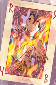
Hellblazer #12, DC, Tula Lotay, @TulaLotay, a cover icon who somehow always finds a way to make the next cover interesting, this time I think she did it with added firey texture. tulalotay.com
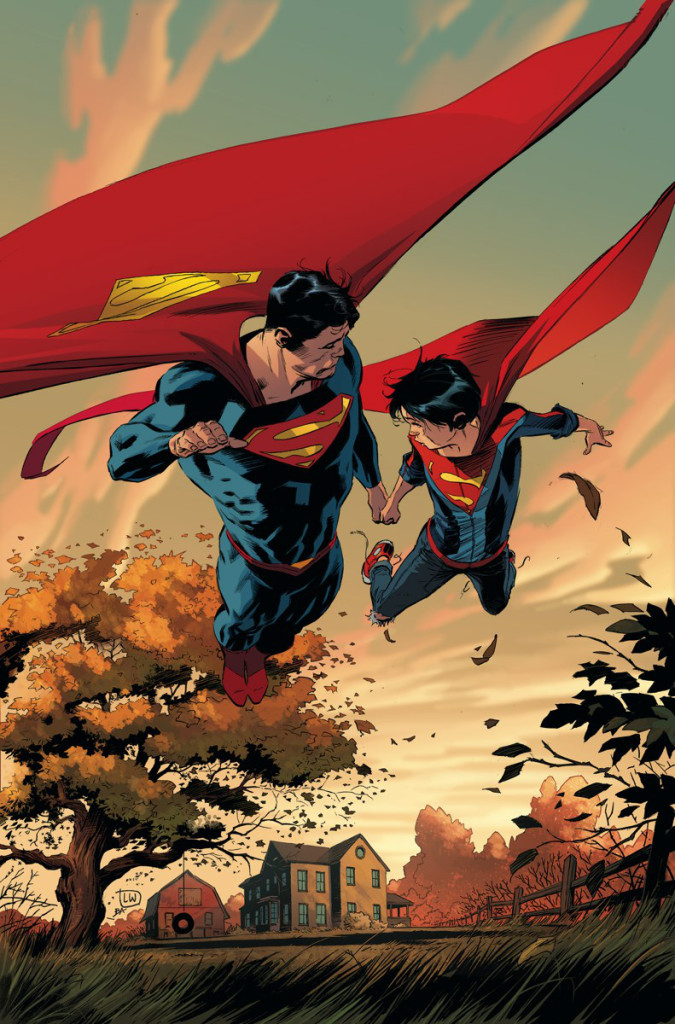
Superman #26 (or 27 can’t tell with the damn 2 a month books), DC, Lee Weeks, @inkdropinc, Mr. Weeks never quite an a-lister seems to have upped his game quite a bit. The cover is stunning bit of naturalistic posing.
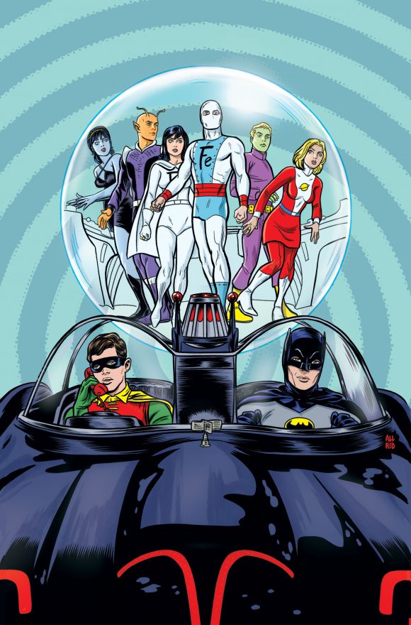
Batman ’66 Meets the Legion #1, DC, Mike Allred, #Mike44red, The Doom Patrol cover for this month was also bloody clever, but I like the clean lines on this one better. http://www.aaapop.com, allredart.blogspot.com
Savage Things #5, Vertigo, John Paul Leon, @JohnPaulLeon, you might see a reoccurrence of his covers in this column, ‘cuz he rocks. His heavy tones and design are almost always spot on. God the sense of space and Eisneresque design on this one is sublime. www.johnpaulleon.com
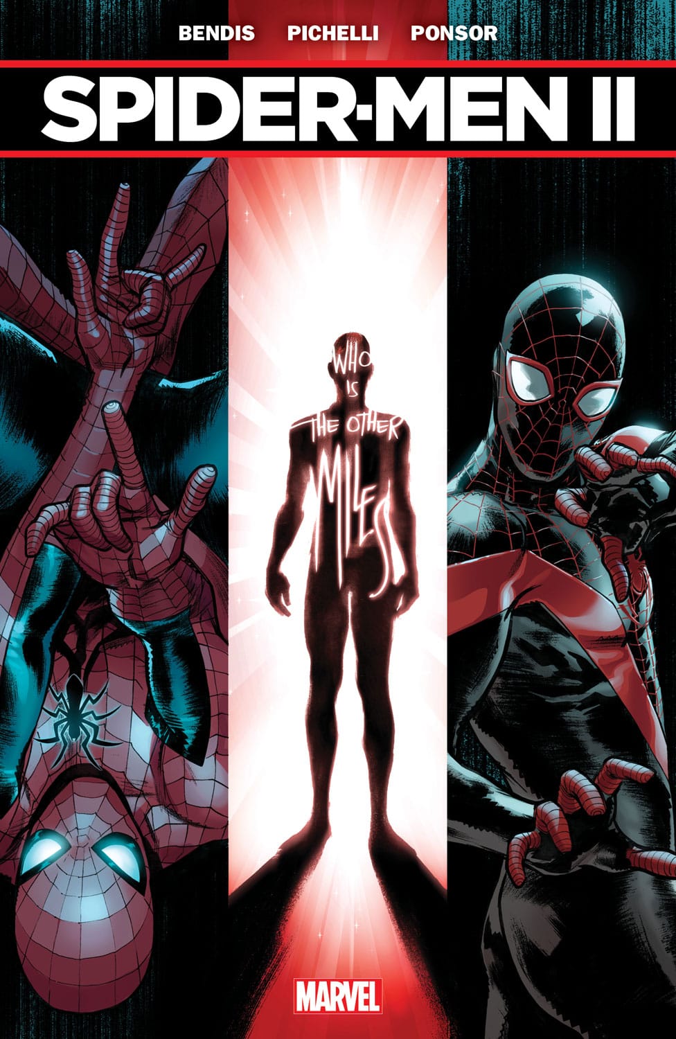
Spider-Men II #1, Marvel, Sara Pichelli, @Sara_Pichelli. Ms. Pichelli just keeps getting better and better. Her character’s body language is always so precise, but the design on this one is awesome too. Justin Ponsor’s inks seem to add a weight to the forms, but holy cow is she good.sarapichelli.tumblr.com sara-pichelli.blogspot.com
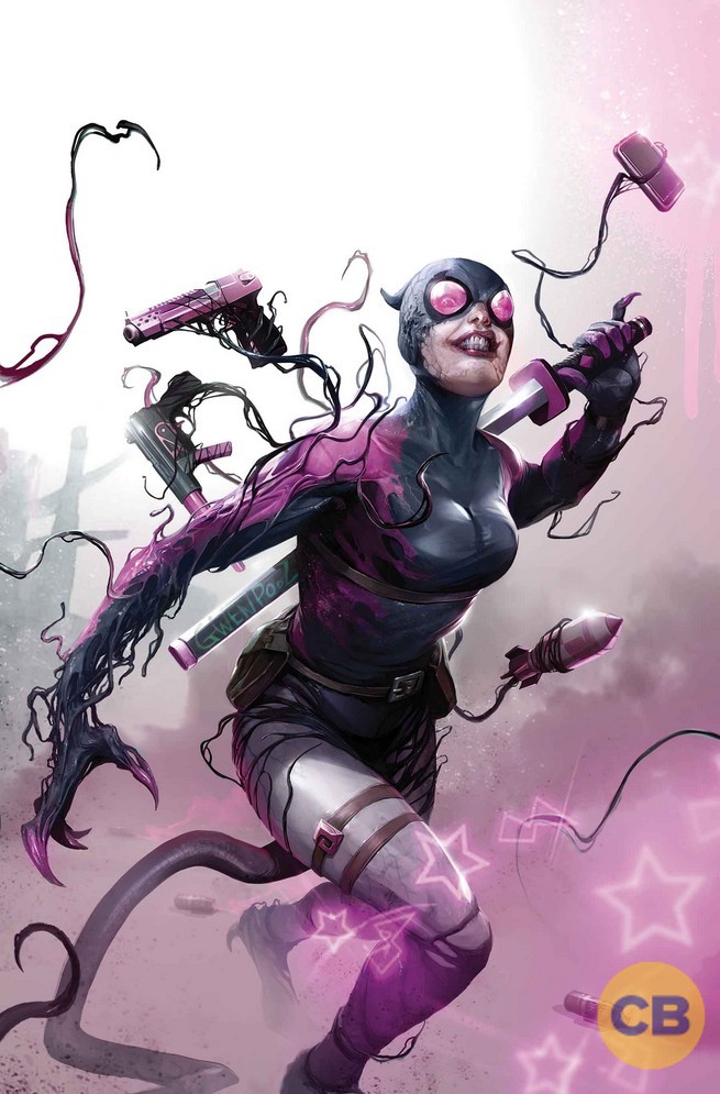
Edge of Venomverse #2, Marvel, Fancesco Mattina, #FrancescoMattina, I’m not much of a Gwenpool fan, but Mattina’s style is so full and saturated, takes some care with his poses and details.
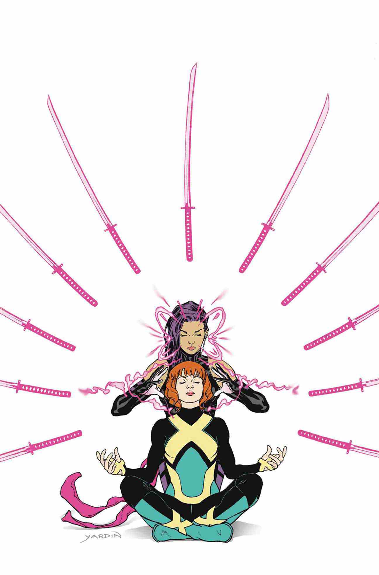
Jean Grey #5, Marvel, David Yardin, @davidyardin. Yardin’s line is so clean and his forms so pure and design so elegantly simple there is nothing not to like. He can flip between pen/ink/flat color and a painter style with ease. Simplly amazing. davidyardin.deviantart.com davidyardin.tumblr.com
Thanos #9, Marvel, Mike Deodato Jr., @mikedeodato, Damn this is a stunning dramatic cover. Deodato has always swam in the heavier tone, Steranko end of the pool, but this cover is a little less busy than his earlier stuff. Man, just go to his tumbler page and look closely at this one, its more like sculpture than drawing. mikedeodatojr.tumblr.com

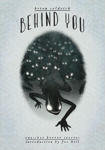
Behind You One-Shot, IDW, Brian Coldrick, @slothhoffman, Clever, simple design and style. Looks like the interior idea might be the same, probably worth picking up. briancoldrick.com
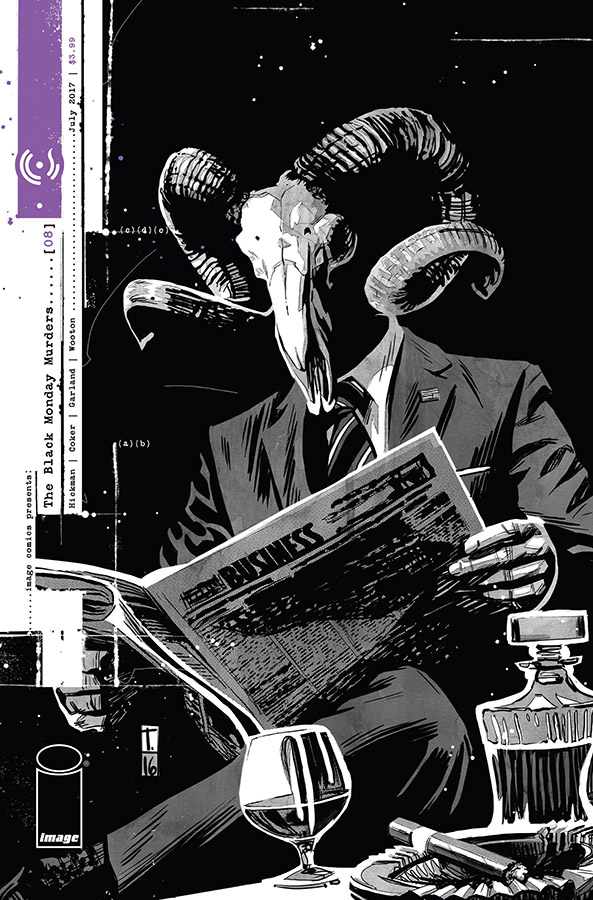
Black Monday Murders #8, Image, Tomm Coker, @tommcoker, Tomm’s covers from the beginning of this book and his interiors have been good from the beginning. His strength has always been a stylize naturalism and he’s got it perfected here. Plus Hickman.
http://www.modelmayhem.com/tommcoker
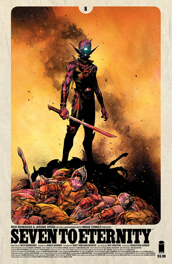
Seven to Eternity #8, Image, Jerome Opena, @JeromeA Opena, @seventoeternity Sometime around Uncanny X-Force Jerome Opena must have stuck the scissors in the socket because after that, I mean he was always good, but since about then he’s been masterful. Interiors are no exception. Plus Remender.
Namwolf #4, Albatross, Logan Faerber, @LoganFaerber, Mostly a clever, picture in picture design, but also liked the character design. https://loganfaerber.dunked.com
Unsound #2, Boom, Jack T. Cole, @newjackcole, Well it’s a really little picture, but I like the Geoff Darrow type hyper detail, the tonal shifts, and varied textures. Might hunt this book down. newjackcole.tumblr.com
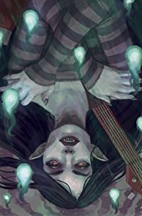
Adventure Time Comics #13, Boom, Kim Myatt, @Ysvyri , I love the risks Adventure Time is willing to take, including more realistic, painterly covers on a cartoon book. The Myatt cover is stunningly competent, maybe even a bit dark in an Ophelia sort of way, but her cover isclever in it’s own way. www.ysvyri.com
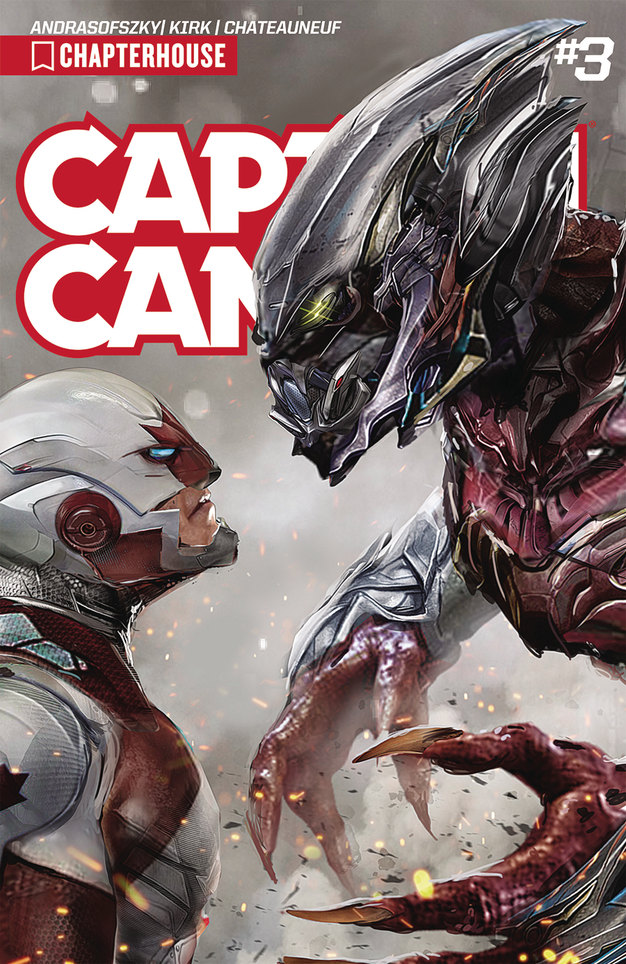
Captain Canuck #3, Chapterhouse, John Gallagher, Not on Twitter, clearly a painter who knows what he is doing and I like the way he played with the Title, eclipsing it with the bad guy. http://uncannyknack.deviantart.com/
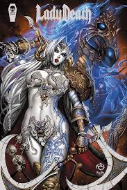
Lady Death: Revelations Illustrated #1, Premium Foil Cover, Just kidding. LadyDeath.com
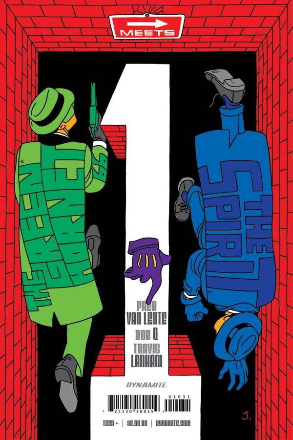
Green Hornet Meets the Spirit #1, Dynamite, Javier Pulido Cover, @JavierPulido12, mischievious, Eisneresque cover damn well executed.
Stan Lee’s Chakra the Invincible #3, Graphic India, Jeevan Kang, Astute color scheme, Mignola simplicity, great design.
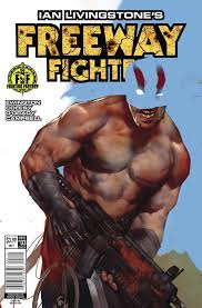
Freeway Fighter #3, Titan Comics, Ben Oliver, @BenOliverArt, again excellent design and execution. Great Bisleyesque figure, but in that cleaner Ben Oliver style. The simplicity of his realism still boggles my mind.
http://benoliverart.blogspot.com .
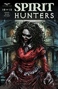
Spirit Hunters, #10, Zenescope, Robby Bevard, @robbybevard, well balanced blacks and composition horror cover, lots of ink lines, but still comes out looking clean and clear. robbybevard.deviantart.com/
Superman #26 (or 27 can’t tell with the damn 2 a month books), DC, Lee Weeks, @inkdropinc, Mr. Weeks never quite an a-lister seems to have upped his game quite a bit. The cover is stunning bit of naturalistic posing.